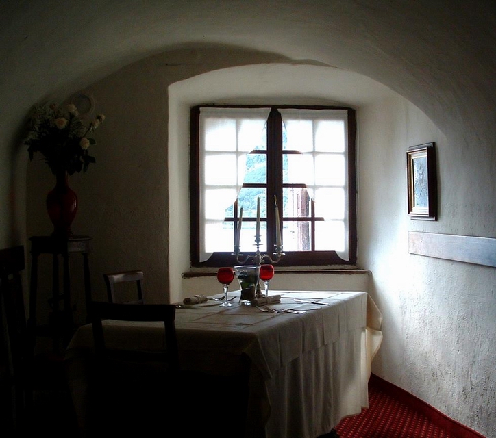
Room from lunch in the castle | |||||||||||||||||||||||||||||||
 This photo is copyrighted by the photographer and may not be used without permission. | |||||||||||||||||||||||||||||||
| |||||||||||||||||||||||||||||||
CritiquesIf you find one of these critiques especially helpful--or especially unhelpful--then please take a moment to register your opinion by clicking one of the buttons to the right of the critique.
CommentsComments are different from critiques. Comments carry no rating, you may write more than one comment per photo, and you may comment on your own photos. If you want to rate this photo, then you should write a critique instead.There are no comments on this photo. | |||||||||||||||||||||||||||||||