|
|
from shagie/Michael
(153)  on October 11, 2003 10:27:47
PM CDT (3) on October 11, 2003 10:27:47
PM CDT (3)

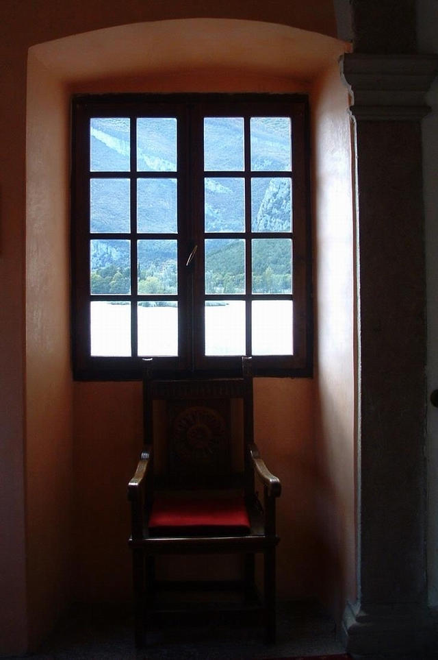
Photographing windows is very difficult. Often (as in this case),
you stretch the dynamic range of whatever media is being used (in
this case, a digtal camera with about 3 stops of range). As such,
the outside is overexposed and possibly a bit washed out, while only
a hint of texture. The human eye can capture an impressive range of
light and chances are you, the photographer, saw more detail in the
forground and din't see a washed out window when you pointed the
camera at it.
To capture a greater dynamic range with the digital camera (alas,
I cannot find a link to help with this - I know its out there
somewhere, I've looked for it before), take three photographs
bracketed each by two stops (keeping the f/stop constant). This will
give one that is 'kind of ok', one that is 'way over exposed' for
the window - but captures the inside, and one that is 'way under
exposed' for the inside, but captures the window. Taking these three
images and then combining the photographs in photoshop and adjusting
the leves of each it is possible to get a much greater range that
would show detail inside and outside clearly.
Another approach would be to use a flash with some significant
punch to it. This would allow you to lighten up the inside. Even
better than a flash (though may be awkward in a castle) would be
multiple lights. The idea here is to bring the level of lighting
inside the room to a similar level as that outside the window.
Composition wise, there is one thing that catches me - its off
center. There's a big dark area on the right and some wood on the
left. I do realize that there is a post on the right and it was your
desire to capture the post too, however this left it feeling
lopsided with nothing to balance the right side.
Reply
Show
ratings
 |
From yagoryo/Eugenio
(14,335) on October 11, 2003
10:44:59 PM CDT
Thanks for the criticism and the suggestions, Very true,
but in the castle I didn't have the possibility' to use other
lights.
Reply
| |
|
Rate this critique
|
| |
|
from jandrade/Jose
Paulo (37,683)  on October 11, 2003 10:16:52
PM CDT (3) on October 11, 2003 10:16:52
PM CDT (3)
Hi again! This one is very good and inspirational. The idea and
composition are very good denoting a good eye for photo
opportunities. Although it is very difficult to obtain a good
exposition due to the contrasting light I think this one although
not perfect is very acceptable. In other words, outside is
overexposed and outside a litte underexposed but the result is not
very bad to the eye. Jose Paulo
Reply
Show
ratings |
|
Rate this critique
|