CritiquesIf you find one of these critiques especially
helpful--or especially unhelpful--then please take a moment
to register your opinion by clicking one of the buttons to the right of
the critique.
 |
|
from bburman/Bonnie
(1,458)  on October 31, 2003 6:10:59
PM CST (1) on October 31, 2003 6:10:59
PM CST (1)

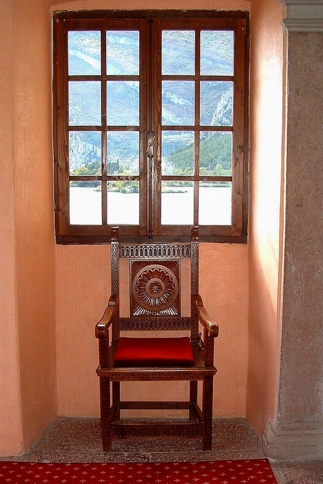
Very nice. I love the earthy tones of the walls, chair, and
outside contrasting with rich red of the rug and chair. The light is
really nice. One tiny thing bothers me and that is that the chair is
not centered under the window. Also, if you could have moved the rug
over slightly so that is ran along the entire bottom length of the
photo I think that would have made a nicer line. Just my opinion. I
hope you found something useful.
Reply
Show
ratings
 |
From yagoryo/Eugenio
(14,335) on October 31, 2003
6:18:42 PM CST
Hi Bonnie, Thanks for the suggestions, the centered of the
chair was escaped me, the carpet and' very great and I could
not move him/it.
Reply
| |
|
Rate this critique
|
|
|
|
| |
|
from voux/Byron
(189) on October 31, 2003 5:43:57
PM CST (1)
from e thumbnail view, it looked symetrical. on closer look wif e
actual size photo, e right wall isnt e same as e left. but tts not
something u could control.
in terms of composition, color, exposure, i think u've done quite
well given e restrictions.
Reply
Show
ratings
|
|
Rate this critique
|
CommentsComments are different from critiques. Comments carry no
rating, you may write more than one comment per photo, and you may comment
on your own photos. If you want to rate this photo, then you should write
a critique instead.
Add
a comment
There are no comments on this photo.
Return to photos
|