CritiquesIf you find one of these critiques especially
helpful--or especially unhelpful--then please take a moment
to register your opinion by clicking one of the buttons to the right of
the critique.
 |
|
from caterpillar/Karl
(857)  on November 4, 2003 2:58:46 PM CST (1) on November 4, 2003 2:58:46 PM CST (1)
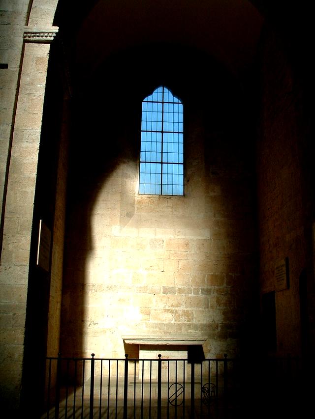
i like your photo, nice idea and composition. especially the
window looks a little bit tilted. i think it's better to turn the
photo a few degrees to the left. thanks, karl.
Reply
Show
ratings
|
 |
Rate this critique
|
|
|
|
| |
|
from deleted141154/deleted
(4,099) on November 4, 2003 2:41:05 PM CST (2)

Hello Eugenio. nice shot, the light on the left is a bit
distracting, and robs our attention from the vivid contrast of the
dark wall and the window. THe main issue, IMO is that the lines of
the window are not vertical, and that would make the shot really
stand out. N.
Reply
Show
ratings
| |
From yagoryo/Eugenio
(14,335) on November 5, 2003 12:58:28 PM
CST
Thanks for the criticism and the suggestions, lighthouse'
of the changes and then I will subdue again
Reply
| |
|
Rate this critique
|
|
|
|
| |
|
from lesanderson/Les
(849) on November 4, 2003 1:54:51 PM CST (3)
I like your idea for this shot but somehow where the window is,
in relation to the lighted wall seems a little off. The window sill
looks like it goes in. Perhaps some work closer up to use that
feature. That vertical light ray on the left catches my eye. Could
you not get that out in PS?
Reply
Show
ratings
|
|
Rate this critique
|
|
|
|
| |
|
from indergi/Inder
(5,846) on November 4, 2003 1:51:51 PM CST (3)
This is a very nice picture, I like the window on top and the
impression of a similar light pattern of an entrance ... looks good
Reply
Show
ratings
|
|
Rate this critique
|
CommentsComments are different from critiques. Comments carry no
rating, you may write more than one comment per photo, and you may comment
on your own photos. If you want to rate this photo, then you should write
a critique instead.
Add
a comment
There are no comments on this photo.
Return to photos
|