CritiquesIf you find one of these critiques especially
helpful--or especially unhelpful--then please take a moment
to register your opinion by clicking one of the buttons to the right of
the critique.
 |
|
from rvwv/Ray
(11,803)  on February 10, 2004 9:26:26 PM CST
(3) on February 10, 2004 9:26:26 PM CST
(3)
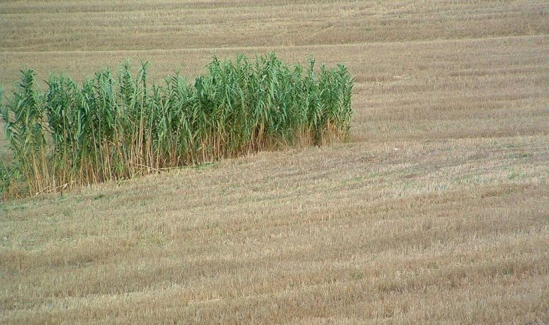
Nice photo Eugenio. Like the contrast between the cut and uncut
wheat. Shows some interesting contrasts in color and textures.
Reply
Show
ratings |
 |
Rate this critique
|
|
|
|
| |
|
from hl/Huub
(10,571) on December 14, 2003 2:24:12 PM CST
(4)
Hi Eugenio. This is an interesting composition. No sky or
horizon, monocolor brownish apart from the patch of green. Wel seen!
Thanks for your critique of mine. Huub
Reply
Show
ratings |
|
Rate this critique
|
|
|
|
| |
|
from wwcsig/Wolfgang
(15,246) on December 13, 2003 3:41:21 PM CST
(4)

Thats a nice play with geometry and colors. I've been playing
with the shot for a while and here are some of my observations - if
you care to know them ;-)
I'd try to play with color adjustments
to add some warmer tones to the straw - it can even be made to look
like warm sunlight shines on it. If I crop a little bit on the right
the composition gets closer to the rule of thirds.
Reply
Show
ratings |
|
Rate this critique
|
|
|
|
| |
|
from nicole/Günter
(1,459) on December 13, 2003 2:56:39 PM CST
(4)
It`s a good picture anyway - but may be a little bit more
contrast and color? I like the shot, the composition - no question.
Greetings from Nuernberg, Guenter
Reply
Show
ratings |
|
Rate this critique
|
|
|
|
| |
|
from david2/David
(960) on December 13, 2003 1:08:23 PM CST
(3)
Hello,
I like the idea of the contrast between the flatened wheat and
the intact plants. The photo might have worked better if you opened
up the space at the top. This might have given you a more sweeping
feeling of space. On the other hand, I don't know what you croped
out up there!
The colors seem a bit mudy to me, I think of wheat as being more
golden in color. This could be a misconception on my part.
Reply
Show
ratings |
|
Rate this critique
|
CommentsComments are different from critiques. Comments carry no
rating, you may write more than one comment per photo, and you may comment
on your own photos. If you want to rate this photo, then you should write
a critique instead.
Add
a comment
| From kienmoser/Gisela
(66,983) on December 13, 2003 1:26:32 PM CST
Hello Eugenio, landscape an admission of this field after the
harvest, it, succeeded well, is a simple and motive nevertheless
worth seeing, the green grasses on the side forms a good contrast
and me fallen also the harmonious colors... (unfortunately thumb
empties)...best regards,Gisela
Reply
|
|
|
|
| From mtpsuper/Maria
Teresa (40,702) on December 14, 2003 11:17:00 AM CST
Ciao Eugenio. I like this kind of contrast, and it's always
pleasant to discover as the country and the fields, too, can be
interesting and poetic.
Good intuition in taking this frame;
maybe I would prefer a little of more "yellow" effect in the field,
but also in this way is a very nice thing.
------------- Mi
piace questo tipo di contrasto, ed è sempre piacevole scoprire come
anche la campagna ed i campi possono essere interessanti e poetici.
Buona l'intuizione di questa inquadratura; forse avrei preferito
un pizzico di effetto di giallo in più nel campo, ma anche così è
una cosa molto bella. Bravo!
(too frequent ecc...)
Reply
|
Return to photos
|