CritiquesIf you find one of these critiques especially
helpful--or especially unhelpful--then please take a moment
to register your opinion by clicking one of the buttons to the right of
the critique.
 |
|
from erina/Erina
(11,062)  on March 13, 2004 12:02:45 PM CST (1) on March 13, 2004 12:02:45 PM CST (1)
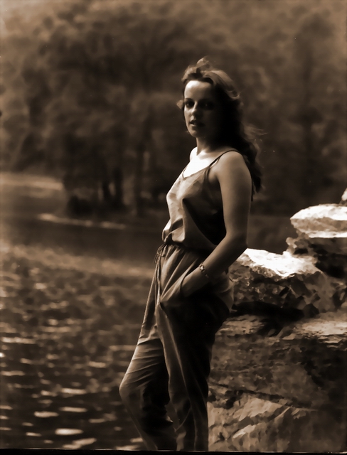
Eugenio, this is a very nice sephia colour photo. the DOF is
excellent. Love the light on the lady as well. Probably the right
side of the face is slightly dark but still can be seen. Looks like
nothing much can be improve on this perfect photo. well done.
Reply
Show
ratings |
 |
Rate this critique
|
|
|
|
| |
|
from realmoliva/Eliseo
(524) on March 2, 2004 1:48:04 PM CST (2)
Hello Eugenio: Rado mentions some very good
points and although he says he is not tearing apart your picture and
that it does have some good points, he fails to mention them. Yes,
rules are meant to be broken I agree with him on that, but also you
have done a superb job with the sepia tone and the soft side
lighting. The tilting? Well, it still got projection
because you used well the rule of thirds, the pose is pretty good,
the use of the shallow depth of field is good, sharpness is good,
and I think you used a diamond diffusing filter that you didn't
mention in your
caption. Overall? I like
your picture very much. Eliseo.
Reply
Show
ratings |
|
Rate this critique
|
|
|
|
| |
|
from flame71/Fabrizio
(113) on February 23, 2004 8:27:53 AM CST
(5)
Nice shot and elaboration. I prefer more grain and a less shadow
on the face of the subject. More detail also in the hairs region. A
shirt maybe is preferable.
Reply
Show
ratings |
|
Rate this critique
|
|
|
|
| |
|
from rado/Rado
(1,826) on February 23, 2004 8:10:40 AM CST
(10)
Hi Eugenio! Since you were trying to achieve a classic portrait
look on this photo I believe the classical rules of composition and
cropping should apply. Please, don't get me wrong, I am not a fan of
conservative rules in photography, but when you are trying to
achieve the classic look, you should follow some classic rules. So,
here are my remarques: first of all, cropping... you shouldn't cut
her legs where you did. You should weather include her feet into
frame weather cut them just below her hands. Then the background...
while taking care of composing your model straight, you forgot about
the river or lake in the background, as a result, you have a tilted
water that would "flow" out of the frame. An old master would put
the camera on the tripod and take care of the bg first and then
repose the model. Besides that I see some strange artifacts on the
rocks behind her that could come from blurring in PS. Something that
would never appear on an old photo. Last but not least, you have a
dark line on the bottom of the frame that should be cropped out.
But don't get me wrong, my intention is not to tear apart your
photo completely. There are also some good points. You have a
beautiful model, her pose is natural and she looks very relaxed.
Maybe a different clothing would also add to the old atmosphere of
the shoot.
All the best, Rado
Reply
Show
ratings
| |
From yagoryo/Eugenio
(14,335) on February 23, 2004 5:49:45 PM
CST
Correct criticism! You have seen many errors that escape
me. I thank You.
Reply
| |
|
Rate this critique
|
|
|
|
| |
|
from mtpsuper/Maria
Teresa (40,702) on February 23, 2004 5:50:30 AM CST
(8)
Hi Eugenio. I find really pleasant this photo, which has all the
fashinating atmosphere of photos of some years ago; I like the way
you've been able to obtain the shadows on the girl's face, and the
light on her, and even the sensation of the wind on her
hairs.
Really interesting, too the sign of reflections on the
water even in a so blurred background. Alltoghether a very fine
composition. It seems to me one of the best your photos here.
Reply
Show
ratings |
|
Rate this critique
|
|
|
|
| |
|
from rvwv/Ray
(11,803) on February 22, 2004 4:31:08 PM CST
(10)
Interesting photo Eugenio. Like the old time look and the
composition of the photo. Might have lightened it also, detailing is
a little soft.
Reply
Show
ratings |
|
Rate this critique
|
|
|
|
| |
|
from gian87/Marta
(59,446) on February 22, 2004 1:25:26 PM CST
(10)

Ciao Eugenio!This "old portrait" in sepia tone is really
attractive and very interesting.This girl surrounded by a background
mysterious and almost unreal is a wonder.Pity that the right side of
its face has been too dark.Wonderful!Best regards,Marta
Reply
Show
ratings |
|
Rate this critique
|
|
|
|
| |
|
from marionella/Marion
(26,499) on February 22, 2004 1:21:33 PM CST
(8)
Good shot with a nice retro look to it, Eugenio. But I miss a bit
of sharpness here and the shot looks a bit dark overall. But still a
very nice shot! Regards Marion
Reply
Show
ratings |
|
Rate this critique
|
|
|
|
| |
|
from niggmanfred/Manfred
(56,458) on February 22, 2004 1:08:52 PM CST
(12)
hello Eugenio, your old Portrait photo of this young woman in the
Sepia execution is marvelous, the pretty face becomes effective here
well to be able to see unfortunate that the left face half somewhat
is too dark, otherwise is it a joy this successful photo work
excuses my English, best regards, Manfred
Reply
Show
ratings |
|
Rate this critique
|
|
|
|
| |
|
from kienmoser/Gisela
(66,983) on February 22, 2004 1:04:37 PM CST
(12)
hello Eugenio ,very nice Portrait photo, I loves the position of
the pretty woman in the picture, interesting is this lighting only
one half of the face shows,I love this sepia colour, nice photo
work...best regards , Gisela
Reply
Show
ratings |
|
Rate this critique
|
CommentsComments are different from critiques. Comments carry no
rating, you may write more than one comment per photo, and you may comment
on your own photos. If you want to rate this photo, then you should write
a critique instead.
Add
a comment
There are no comments on this photo.
Return to photos
|